On this page
General information only — not financial, investment, legal, or tax advice. Verify all data independently and seek professional advice before making investment decisions. Full disclaimer.
A $4 million childcare acquisition in the wrong catchment can sit at 60% occupancy for three years — capital tied up, the wrong fee tier locked into the lease, and reinvestment blocked. A comparable centre a kilometre away, in a catchment with genuine undersupply, can reach 90% occupancy within eighteen months. The difference is rarely the operator. It is almost always the location.
The opportunity is real, with demand anchored by household formation and immigration. The question is not whether this demand exists; however, it is whether it can be identified before it is priced in, and whether the site can physically deliver the centre the business case requires.
This guide walks through the full process: whether the goal is opening a childcare centre, acquiring a childcare business, or running a feasibility study on a greenfield site.
Why site-level analysis changes everything: Two {PAIR_ADJACENCY}regions, {EXAMPLE_HIGH_NAME} and {EXAMPLE_LOW_NAME}, differ by more than {ADJACENT_SA4_KPP_MULTIPLE} on the headline supply ratio. But at the site level, it isn't always so simple: a property catchment inside the "undersupplied" SA4 can turn out well-served, while a property in the "comfortable" SA4 can reveal a notable place deficit in its local catchment area, with premium income, high workforce participation and daily workforce movements intensifying demand pressures. See the full worked example →
Australia has {LDC_CENTRE_COUNT} Long Day Care centres serving roughly {POP_0_4} children aged 0–4, a national supply ratio of {KPP_NATIONAL} children per place. Among Australia's most supply-pressured SA3 regions right now:
- {TOP_KPP_AREA_1} — {TOP_KPP_VALUE_1} children per place, {TOP_KPP_PLACES_NEEDED_1} places short of the regional supply level
- {TOP_KPP_AREA_2} — {TOP_KPP_VALUE_2} children per place, {TOP_KPP_PLACES_NEEDED_2} places short
- {TOP_KPP_AREA_3} — {TOP_KPP_VALUE_3} children per place, {TOP_KPP_PLACES_NEEDED_3} places short
- {TOP_KPP_AREA_4} — {TOP_KPP_VALUE_4} children per place, {TOP_KPP_PLACES_NEEDED_4} places short
- {TOP_KPP_AREA_5} — {TOP_KPP_VALUE_5} children per place, {TOP_KPP_PLACES_NEEDED_5} places short
01The opportunity right now
Why childcare has held investor attention through cycles that have weakened other sectors
The childcare business is structurally different from most property sectors. Three reasons it has held investor interest through cycles that have significantly weakened residential and office:
- Subsidised demand. The Child Care Subsidy covers a significant proportion of fees for eligible families (Department of Education — CCS Quarterly Reports). Government spend on the subsidy is substantial and continues to grow. Bipartisan policy support has been consistent across governments, most recently reinforced by the Productivity Commission's 2024 inquiry recommending a path to universal ECEC access.
- Workforce-participation tailwind. Childcare access is a primary lever for women's workforce participation. Public investment in the sector is structurally rising, not falling, both to support participation and to improve early learning outcomes.
- Pre-lease commitment structure. Developers can sign a strong operator before construction. That makes development feasible at lower risk than pure residential, particularly in the current high-cost build environment.
But the sector hides a problem that many participants miss: massive hyperlocal variation in supply that broader boundary-based analysis can't see. The national Kids Per Place ratio is {KPP_NATIONAL}. Even at the broad SA4 level, Greater {KPP_SPREAD_METRO} ranges from {KPP_SPREAD_LOW} to {KPP_SPREAD_HIGH}, and even adjacent SA4 regions differ by more than {ADJACENT_SA4_KPP_MULTIPLE}. At finer geographic levels the variation is wider still.
We are yet to meet a parent who takes statistical boundaries into consideration when putting their child into day care.
Parents in metro Australia are typically willing to travel up to {PARENT_DRIVE_TIME_MAX} to their nearest available childcare. The supply analysis that matters is the one that mirrors that behaviour: drive-time catchments, not LGA aggregates.
02Using AreaSearch for childcare
Two starting points: the tools are the same, the entry point differs
AreaSearch's childcare tools work for two different situations. The path you take depends on your starting point:
Searching for opportunities
- No specific site yet
- Goal: identify undersupplied areas, then find viable sites within them
- Use the heatmap to scan for supply-pressured regions
- Use Childcare Benchmarks for state-by-state context and school-catchment shortlisting
- Use Target Search to filter nationally by your criteria
- Read area profiles for shortlisted regions
- Run a custom catchment around candidate sites to confirm
Evaluating a specific site
- A specific address is under consideration
- Priority: confirm whether the demand is real before committing time and capital
- Read the area profile for the suburb, free, no sign-up
- Run a custom catchment around the address for the site-specific supply read
- Cross-reference against Childcare Benchmarks for state context
- Check the site fit against NQF floorspace requirements (Section 04)
The tools are described in detail below. For most users, the area profile is the natural starting point: it is publicly accessible, covers any area in Australia, and provides demographic and supply context immediately.
The heatmap — broad scan
The homepage choropleth heatmap lets you toggle childcare layers across the entire country. Within thirty seconds you can identify the regions where supply pressure concentrates. Use it to narrow focus to the sub-regions that warrant further investigation. It identifies where to look, not what to conclude.
Area and suburb profiles — free taster
Open any suburb or SA2 area profile and read the main sections that matter for childcare:
- Population — Age section. 0–4 cohort size and percentage. The national average is around {POP_0_4_PCT_NATIONAL} of population; areas above {POP_0_4_PCT_STRONG_DEMAND} signal strong demand. (The Mitchell Institute's Childcare Deserts & Oases report uses this same cohort to map supply gaps nationally.)
- Households. The share of couples-with-children. The higher this is, the deeper the LDC demand pool.
- Income. Median household income tells you what fee tier the catchment can support.
- Employment. Female workforce participation rate is a key utilisation-rate driver. High participation means high demand for full-week LDC.
- Development. New dwellings mean new families. Local residential pipeline shows you future demand while planned childcare DAs indicate an area's risk profile.
Childcare Benchmarks — sector context
The Childcare Benchmarks page provides the cross-area view that a single area profile does not: state-by-state KPP comparison, net place approvals over time, by capital city. Use it to build a shortlist of regions worth investigating further, and to understand where your candidate site sits relative to the broader market.
Target Search — multi-criteria shortlisting
Target Search is reverse-engineered location analysis. Define the success criteria (the metrics most important your business) and the platform returns a ranked list of all areas that meet it, anywhere in Australia. Available to Pro users.
Draw — the site-specific decision tool
Custom catchments provide Pro tier users with the most detailed local assessment available on the platform. Draw a catchment around any address — radius (1-{CHILDCARE_CATCHMENT_RADIUS} is the convention in metro areas), polygon, or drive-time isochrone (the parent-behaviour anchor is {PARENT_DRIVE_TIME_MAX}). The custom catchment gives you the demographic + supply analysis tailored to the actual site you're considering, not the LGA it sits in. The same map carries lot-level planning layers — statutory zoning, development controls such as building height and minimum lot size, and heritage items.
03The signals that matter
The key metrics for assessing a childcare site
- LDC supply and Preschool/Kindergarten (PSK) supply separately and combined; the dual ratio gives additional context in states where standalone PSK services are ACECQA-registered. In WA, TAS and NT, preschool equivalents are delivered almost exclusively through the school system and don't appear in ACECQA data, so the LDC-only ratio and narrower age band metrics are the more reliable signals in those jurisdictions.
- Out of School Hours Care (OSHC) supply — relevant for families with school-age children, and OSHC operators, while often a strong signal of elevated demand for other care types as well.
- Narrower age-band ratios: rather than treating 0–4 as one group, AreaSearch breaks supply and demand into estimated bands for a varied perspective: LDC per 0–2, PSK per 3–4, and OSHC per 5–12. The demand profile for under-2s (where educator-to-child ratios and costs are higher) is materially different from 3–4-year-olds approaching the preschool transition.
Is your catchment undersupplied?
Check across age groups and service types to better plan your centre mix
How has your catchment's supply landscape changed?
Net approvals year-on-year — the supply pipeline can shift sharply from one year to the next
Places needed to match regional supply
The combined ratio tells you how supply-pressured a catchment is. The places-needed calculation turns that into an actionable number:
places needed = (catchment 0–4 population ÷ regional ratio) − existing places
For example: a catchment has 542 children aged 0–4 and 184 existing LDC+PSK places. The surrounding region averages 2.0 children per place. To match that ratio, the catchment would need 271 places (542 ÷ 2.0), leaving it 87 places short. That number tells you whether the gap is meaningful (a 90-place centre closes most of it) or marginal (too small to support a viable new centre).
How big is the gap?
Turn a ratio into a number you can act on and build the centre the area needs
The school-catchment lens
One of AreaSearch's most useful lenses for childcare opportunity identification is the relationship between primary schools and surrounding LDC supply. The logic is straightforward: parents structure their daily commute around the older child's school drop-off. Childcare options near that route get used. Options off that route, even if nominally closer to home, often don't.
The most commercially interesting childcare gaps are frequently found not by looking at broad demographic maps, but by looking at what's missing around schools that serve young families. The Childcare Benchmarks page lets you explore this relationship: where schools sit relative to existing LDC supply, and where the gaps are most pronounced.
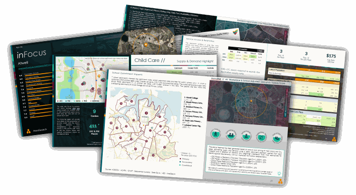
Catchment reports on demand. Pro Childcare users can receive a full catchment report in minutes, for the same credit cost as loading a catchment on the platform.
Catchment density — absolute market size matters
A supply ratio on its own can mislead. A small catchment can show a high KPP ratio, and therefore look like a strong opportunity, but the absolute 0–4 population may be too small to support a commercially viable new centre post-development. Conversely, a densely populated catchment with a moderately elevated ratio can represent a far larger commercial prize.
The signal to watch: population density relative to the ratio. A catchment with 1,250 children aged 0–4 and a ratio of 3.2 children per place is usually a stronger commercial proposition than a catchment with 280 children aged 0–4 at 5.7 children per place, even though the second looks more supply-constrained on paper.
That said, smaller regional centres can be genuinely attractive. A town that can support exactly one more centre, and where the incumbent operators are at capacity, is often an excellent low-competition opportunity.
A higher ratio doesn't always mean a bigger opportunity
Catchment B looks more pressured — but A has 4× the children and the absolute gap supports a 90-place centre
Income, SEIFA and female workforce participation
A supply gap means little if the catchment cannot support the fees and occupancy rates required. Three income-related signals matter:
- Median household income. The primary fee-tier indicator. Higher income catchments support premium daily rates ({FEE_PREMIUM_TIER_RANGE} at the top end) and are less sensitive to fee increases. Lower income catchments rely more heavily on the Child Care Subsidy and are more price-elastic.
- SEIFA. A composite index across income, education, occupation and disadvantage. High-SEIFA catchments correlate strongly with both premium fee tolerance and high female workforce participation. Low-SEIFA catchments may show high KPP ratios partly because services are less commercially viable, not just because they're undersupplied.
- Female labour force participation rate. The most direct usage-rate driver. High female participation means high demand for full-week, full-day LDC. This is the number that converts a supply gap into booked places; an undersupplied catchment with low female participation may not fill a new centre as quickly as the ratio suggests. Stronger labour markets can also mean higher competition for staff, however, and commute and cost-of-living pressures for said staff.
National daily LDC fee landscape (live from latest data, see also the Productivity Commission's Report on Government Services for published fee benchmarks): national average {NATIONAL_AVG_DAILY_FEE}; highest SA4 is {FEE_HIGHEST_SA4_NAME} at {FEE_HIGHEST_SA4_VALUE}; mid-tier range {FEE_MID_TIER_RANGE}; premium tier {FEE_PREMIUM_TIER_RANGE}.
Can the catchment support premium fees?
All three need to align — high income with low female participation means lower full-week LDC demand
How tight is the labour market?
Lower unemployment rates mean higher demand, but also tighten the labour market for childcare operators
What does childcare cost here?
Where a catchment sits in the fee landscape tells you what parents will pay, and who your competitors are
Working population inflows and commercial land use
For some catchments, residential demographics tell only half the story. Areas with significant daytime working-population inflows, near CBDs, major business parks, hospitals, or industrial precincts, can generate childcare demand that doesn't show up in the residential 0–4 count. Parents living elsewhere may prefer a centre close to their workplace over one close to home, particularly for the drop-off leg of the commute.
When assessing a commercially-zoned or mixed-use site, it's worth considering the daytime working population alongside the residential catchment. A site that looks marginal on residential demographics alone may have a strong daytime demand uplift the residential-only view misses entirely. for the user's convenience, adjusted KPP ratios are generated and displayed on the platform.
The demand you can't see from home
Near employment hubs, worker inflows can change the picture entirely
Births as a leading indicator
Birth trends point to where 0–4 demand is heading. AreaSearch uses yearly population-forecast data to project the 0–4 cohort forward at catchment level. A catchment with rising births and already-constrained supply will be critically undersupplied by the time a new centre opens.
Where is demand heading?
Rising local births signal building demand pressure — a diverging trend from the national average is a strong forward indicator
The forward cohort view
A lease decision today commits you to a market a decade out. Today's snapshot is not sufficient. AreaSearch projects the 0–4 cohort forward at catchment level, showing how many additional places will be needed as demand grows. Use Target Search to filter for catchments where projected 0–4 growth is in the top decile nationally; those are areas where you build into a tightening market, not against a flattening one.
Are you building into a growing market?
Top-decile growth catchments are where you build into a tightening market
Development approvals per 100 population
A declining trend signals tightening future housing supply, potentially dampening child care demand
Incoming supply
Every supply metric above relies on ACECQA data, which only captures centres that have been granted a service approval. A centre's ACECQA licence is generally not issued until after development, so a centre with an approved DA and construction underway can be 12+ months away from showing up in any supply ratio. A catchment that looks undersupplied today may be well-served, or even oversupplied, within 18–30 months if several approved centres are in the pipeline.
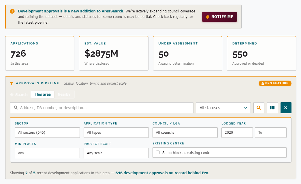
Development applications fill that gap. DAs are lodged through local councils and are searchable through council DA trackers (and in some states, state planning portals), which AreaSearch track. The key signals to look for:
- Approved but not yet built — centres with DA approval that are under construction or awaiting ACECQA service approval. These represent committed supply that has not yet entered any ratio.
- Applications under assessment — DAs currently lodged. Not all will be approved, but clusters of applications in one area signal that other investors have identified the same opportunity.
- Site plans and place counts — DA documentation provided at the exhibition stage typically includes architectural plans, intended place counts (councils generally require this for parking, traffic and acoustic assessment), and key contact details. These help to estimate the scale of incoming supply at the catchment level.
AreaSearch surfaces development application data on the platform, so you can factor incoming supply into a catchment assessment alongside the existing-supply metrics above, without separately trawling council trackers. Reviewing the DA pipeline in your catchment is an essential due diligence step that can fundamentally change the investment case.
04The site fit
NQF floorspace, the 60-place ECT threshold, Class 9b, and the timeline reality
A catchment with strong demand and good fee tolerance is only half the assessment. The next step is confirming whether the site can physically accommodate the centre the business case requires.
The Australian regulatory floor is set by the Education and Care Services National Regulations. Two numbers matter most:
- Reg 107 — Indoor unencumbered space: {INDOOR_SPACE_PER_CHILD}
- Reg 108 — Outdoor unencumbered space: {OUTDOOR_SPACE_PER_CHILD}
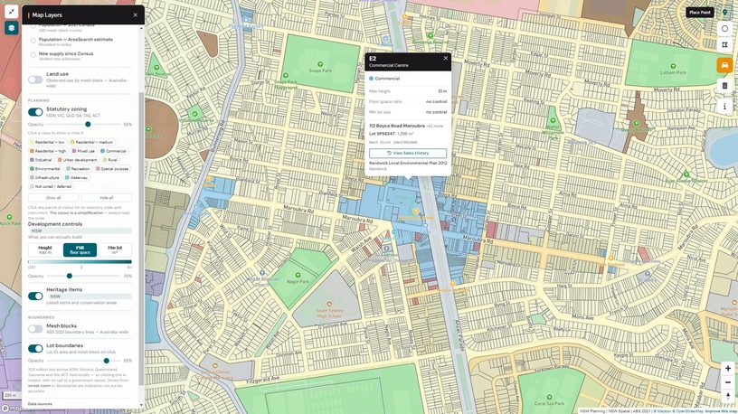
Statutory zoning, development controls and lot boundaries on the map — click any lot for its zoning code and controls.
"Unencumbered" excludes corridors, bathrooms, nappy change, kitchens, cot rooms, staff rooms, storage, and built-in furniture. Gross internal floor area is typically {GROSS_AREA_OVERHEAD} larger than headline unencumbered × places (ACECQA — Quality Area 3).
Screening shortcut for typical suburban centres:
| Places | Indoor unencumbered | Outdoor unencumbered | Typical site area |
|---|---|---|---|
| 75 | {INDOOR_75_PLACES} | {OUTDOOR_75_PLACES} | {SITE_AREA_75_PLACES} |
| 90 | {INDOOR_90_PLACES} | {OUTDOOR_90_PLACES} | {SITE_AREA_90_PLACES} |
| 120 | {INDOOR_120_PLACES} | {OUTDOOR_120_PLACES} | {SITE_AREA_120_PLACES} |
A 1,200 m² block cannot support 90 approved places under these requirements. Outdoor space waivers are possible for inner-city / vertical centres under Reg 4.4, but they're discretionary and conditional.
Site feasibility — from gross site area to approved places
The screening table above shows the indoor and outdoor space a centre needs. But the total site must also accommodate everything around those areas, and this is where many feasibility assessments underestimate the land required:
- Car parking and drop-off: council parking rates vary by state and location. NSW's general rate is 1 space per 4 children, reduced near train stations. Victoria's previous flat rate of 0.22 spaces per child was replaced in December 2025 with a per-employee, category-based system tied to public transport access. A 90-place centre typically requires {PARKING_90_PLACES}.
- Setbacks and driveways: front, side, and rear setbacks are set by the local planning scheme and can consume a material portion of a suburban block. Driveway width requirements for drop-off circulation add further constraints.
- Landscaping and buffers: many councils impose minimum deep-soil and landscaping percentages, particularly on residential-zoned sites. Acoustic buffer zones to neighbouring properties are common conditions of consent.
The result: a site's gross area can be 40–60% larger than the combined indoor and outdoor play area it delivers. A block that looks generous on a title search may leave too little usable space once parking, setbacks, and landscaping are subtracted. Working backwards from the gross site area to an achievable place count, rather than forward from a target number of places, is the more reliable approach for greenfield feasibility.
Educator-to-child ratios — the wage cost driver
The national minimum ratios are set by Regulation 123 of the Education and Care Services National Regulations:
| Age band | National ratio | State variation |
|---|---|---|
| 0–24 months | {RATIO_UNDER_2} | Uniform |
| 24–36 months | {RATIO_2_3_NATIONAL} | VIC: {RATIO_2_3_VIC} |
| 36 months – school age | {RATIO_3_5_NATIONAL} | NSW, ACT, NT, SA, TAS often operate {RATIO_3_5_OTHER_STATES} |
The Victorian {RATIO_2_3_VIC} ratio for two-to-three-year-olds adds roughly {VIC_WAGE_PREMIUM} to wage cost versus the equivalent NSW/QLD centre on the same plan. Material to EBITDA modelling.
The 60-place threshold
The single most important number in operator economics for greenfield development. Under Reg 130–134, centres with fewer than {ECT_THRESHOLD_PLACES} approved places require one Early Childhood Teacher in attendance for ≥6 hours/day. Centres of {ECT_THRESHOLD_PLACES}+ places require a second ECT for ≥3 hours — annual cost in the order of {ECT_ANNUAL_COST_RANGE} in metro markets.
This threshold undermines many investor business cases modelled at 75 places. Conversely, a 58-place centre runs on a single ECT FTE — making sub-{ECT_THRESHOLD_PLACES} boutique formats viable on smaller sites.
Building code, planning, and the timeline reality
Childcare centres are NCC Class 9b (NCC 2022 — Class 9b). Adaptive reuse almost always triggers a full Class change to 9b and an upgrade to current NCC and Disability (Access to Premises) Standards. Fire compartmentation, sanitary rebuild, and accessibility works can match the cosmetic fitout cost. These costs should be estimated carefully — adaptive reuse is not always cheaper than greenfield construction.
DA timelines in metro councils run {DA_TIMELINE_METRO}. Total greenfield DA-to-opening is realistically {TOTAL_GREENFIELD_TIMELINE}, with {GREENFIELD_TIMELINE_MIDPOINT} a commonly-quoted industry midpoint. Two parallel approval streams must converge: planning/construction and ACECQA Provider Approval + Service Approval + federal CCS approval. Service Approval inspection scheduling is a recurring bottleneck, particularly in NSW.
NQS quality rating — the under-discussed commercial lever
The National Quality Standard rating influences fee headroom and waitlist depth more than most investors model. Exceeding centres in higher-income catchments can often sustain a fee premium over Meeting peers, with operators in some markets reporting a gap of {EXCEEDING_FEE_PREMIUM} or more. Working Towards is a red flag for any acquisition. The latest sector-wide quality statistics are published in ACECQA's quarterly NQF Snapshots, and every centre's current rating is searchable on Starting Blocks. The seven Quality Areas assessed:
- Educational program and practice
- Children's health and safety
- Physical environment
- Staffing arrangements
- Relationships with children
- Collaborative partnerships with families and communities
- Governance and leadership
How the calculator works
All sliders are interconnected. Use the Operator / Investor toggle to pick your position and Lease / Buy / Build to pick your entry route — the inputs adjust to match. Inputs are grouped into three tabs that flow in order: Site sets the building and outdoor area that cap capacity, Operation covers revenue, staffing and running costs, and Property covers rent, acquisition or development cost, and exit assumptions. Hover any dotted label for a tooltip explaining that input. Set the inputs for your centre and request your cash flow model — we email you the full model (revenue, EBITDA, returns and a year-by-year cash flow) built from your settings.
Childcare Returns Calculator
Sensitivity — EBITDA at different occupancy levels
This calculator is a financial modelling tool provided by AreaSearch for indicative analysis only — not investment, tax, or legal advice. The default assumptions are generic starting points and may not reflect the specific conditions of any site, market, or transaction. Excludes CCS modelling, tax, working capital during ramp-up, and centre-specific factors. Wage model uses age-mix ratios — actual staffing depends on room structure and rostering. Users should verify all inputs independently and seek professional advice before making any financial decisions based on these projections. AreaSearch accepts no liability for losses arising from reliance on the outputs of this model. Past performance and modelled projections are not indicative of future results.
05Worked example
{EXAMPLE_HIGH_NAME} vs {EXAMPLE_LOW_NAME} — two {PAIR_ADJACENCY}SA4 regions in Greater {PAIR_METRO}, with materially different investment profiles.
{EXAMPLE_HIGH_NAME} and {EXAMPLE_LOW_NAME} are {PAIR_ADJACENCY}SA4 regions in Greater {PAIR_METRO} — same metropolitan economy, same state regulator, same CCS subsidy regime. On paper, they should look similar. The data shows otherwise.
| {EXAMPLE_HIGH_NAME} | {EXAMPLE_LOW_NAME} | |
|---|---|---|
| Children per LDC place (KPP) | {EXAMPLE_HIGH_KPP} | {EXAMPLE_LOW_KPP} |
| Median household income | {EXAMPLE_HIGH_INCOME} | {EXAMPLE_LOW_INCOME} |
| Female workforce participation | {EXAMPLE_HIGH_FEM_LFP} | {EXAMPLE_LOW_FEM_LFP} |
| SEIFA decile | {EXAMPLE_HIGH_SEIFA} | {EXAMPLE_LOW_SEIFA} |
| School places per LDC place | {EXAMPLE_HIGH_SCHOOL_PER_LDC} | {EXAMPLE_LOW_SCHOOL_PER_LDC} |
| Average daily fee | {EXAMPLE_HIGH_MEAN_FEE} | {EXAMPLE_LOW_MEAN_FEE} |
| 0–4 cohort growth since Census | {EXAMPLE_HIGH_POP_GROWTH} | {EXAMPLE_LOW_POP_GROWTH} |
More than {ADJACENT_SA4_KPP_MULTIPLE} variation in relative demand between two {PAIR_ADJACENCY}SA4 regions. But the ratio alone doesn't tell the full story. The region with the higher KPP has lower income, lower SEIFA and lower female workforce participation — fewer families using full-week LDC — which partly explains the supply gap. The gap is real, but the commercial opportunity is more nuanced than the headline KPP suggests. A single ratio can mislead in either direction. Analysis that reads income, workforce participation, school proximity and fee landscape alongside the supply ratio, and across a custom geography, provides the picture needed to commit capital with confidence.
Site-level analysis within each SA4
The SA4 comparison above is useful context — but it's an average across a large region. Childcare supply is physically concentrated at specific addresses, not spread evenly across a statistical boundary. A parent's real choice set is the centres within a short drive of their home, regardless of which SA4 those centres fall in. A site catchment routinely crosses multiple SA2, SA3 and even SA4 boundaries — Site A below intersects two SA4s — so it captures supply and demand that no single regional average accounts for. The result: pockets within an "undersupplied" region can be locally saturated, and pockets within a "well-supplied" region can have genuine gaps. Below are two illustrative site catchments that demonstrate exactly this.
Site A — {EXAMPLE_HIGH_NAME} SA4
Illustrative site · SA4 KPP: {KPP_SPREAD_HIGH}
{SITE_A_GEO}
| 1.5 km | 5 min drive | |
| Population | {SITE_A_POP_NEAR} | {SITE_A_POP_DRIVE} |
| Children aged 0–4 | {SITE_A_CHILDREN_NEAR} | {SITE_A_CHILDREN_DRIVE} |
| LDC places | {SITE_A_PLACES_NEAR} | {SITE_A_PLACES_DRIVE} |
| KPP | {SITE_A_KPP_NEAR} | {SITE_A_KPP_DRIVE} |
| Forecast pop growth | {SITE_A_GROWTH_NEAR} | {SITE_A_GROWTH_DRIVE} |
| Required places (today) | {SITE_A_REQ_TODAY_NEAR} | {SITE_A_REQ_TODAY_DRIVE} |
| Required places ({FORECAST_YEAR}) | {SITE_A_REQ_FCST_NEAR} | {SITE_A_REQ_FCST_DRIVE} |
| Median household income | {SITE_A_INCOME_NEAR} | {SITE_A_INCOME_DRIVE} |
| SEIFA decile | {SITE_A_SEIFA_NEAR} | {SITE_A_SEIFA_DRIVE} |
| Female labour force | {SITE_A_FEM_LF_NEAR} | {SITE_A_FEM_LF_DRIVE} |
{SITE_A_VERDICT}
Site B — {EXAMPLE_LOW_NAME} SA4
Illustrative site · SA4 KPP: {KPP_SPREAD_LOW}
{SITE_B_GEO}
| 1.5 km | 5 min drive | |
| Population | {SITE_B_POP_NEAR} | {SITE_B_POP_DRIVE} |
| Children aged 0–4 | {SITE_B_CHILDREN_NEAR} | {SITE_B_CHILDREN_DRIVE} |
| LDC places | {SITE_B_PLACES_NEAR} | {SITE_B_PLACES_DRIVE} |
| KPP | {SITE_B_KPP_NEAR} | {SITE_B_KPP_DRIVE} |
| Forecast pop growth | {SITE_B_GROWTH_NEAR} | {SITE_B_GROWTH_DRIVE} |
| Required places (today) | {SITE_B_REQ_TODAY_NEAR} | {SITE_B_REQ_TODAY_DRIVE} |
| Required places ({FORECAST_YEAR}) | {SITE_B_REQ_FCST_NEAR} | {SITE_B_REQ_FCST_DRIVE} |
| Median household income | {SITE_B_INCOME_NEAR} | {SITE_B_INCOME_DRIVE} |
| SEIFA decile | {SITE_B_SEIFA_NEAR} | {SITE_B_SEIFA_DRIVE} |
| Female labour force | {SITE_B_FEM_LF_NEAR} | {SITE_B_FEM_LF_DRIVE} |
{SITE_B_VERDICT}
The takeaway: The SA4-level ratio said {EXAMPLE_HIGH_NAME} was undersupplied and {EXAMPLE_LOW_NAME} was comfortable. The site-level catchments tell the opposite story — a saturated pocket inside the "undersupplied" region, and a genuine gap inside the "well-supplied" one. This isn't an anomaly; it's what happens when supply is clustered at specific locations and regional averages smooth the variation away. The regional comparison identifies where to look — the site-level catchment determines whether the opportunity is actually there.
Sources: ABS · ACECQA · ACARA · {CENSUS_YEAR} Census · Department of Education · ACCC Childcare Inquiry (Dec 2023) · NCC 2025 · Productivity Commission · Seek · AreaSearch. Updated {LATEST_REFRESH_DATE}. This article is a preliminary scoping resource. Make your own enquiries and seek independent professional advice before acting on any information here.